Cabo Verde
The flag of Cabo Verde
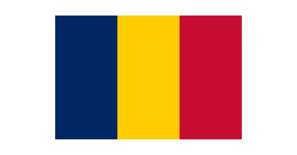
The flag of Cabo Verde, also known as Cape Verde, is a striking and meaningful emblem that reflects the island nation's history, geography, and aspirations. Officially adopted on September 22, 1992, the current flag replaced an earlier design that closely resembled that of Guinea-Bissau, signaling a shift in national identity and political direction after years of independence. The updated design emphasizes Cabo Verde’s status as an independent and sovereign island nation, distinct in culture and governance.
The flag features a blue field with a horizontal band of three stripes near the bottom: two thin white stripes surrounding a thicker red stripe. Positioned slightly off-center to the hoist side are ten yellow five-pointed stars arranged in a circular pattern. Each element of this design carries symbolic meaning tied to the nation’s heritage and ideals.
The blue background represents both the vast Atlantic Ocean that surrounds the archipelago and the sky that stretches over it. As an island nation composed of ten volcanic islands, Cabo Verde’s identity is inherently tied to the sea. The ocean not only connects the islands but has also played a significant role in the country’s history, from trade and migration to fishing and exploration.
The horizontal stripes—white, red, and white—stand for peace, the road to progress, and national unity. The red stripe, placed between two white ones, symbolizes the hard work and sacrifice of the Cabo Verdean people as they strive for development and a better future. The white stripes represent peace and integrity, core values that the nation upholds.
The most distinctive feature of the flag is the circle of ten yellow stars. These stars represent the ten main islands that make up the country: Santiago, Santo Antão, São Vicente, São Nicolau, Sal, Boa Vista, Maio, Fogo, Brava, and Santa Luzia (the latter being uninhabited but still counted geographically). The circular arrangement of the stars conveys the idea of unity among the islands despite their physical separation.
The 1992 redesign of the flag marked a deliberate move away from the Pan-African colors (green, yellow, and red) found in the previous flag, which signified solidarity with African liberation movements. The change reflected Cabo Verde’s decision to pursue a more independent and globally engaged identity, particularly following the end of its political union aspirations with Guinea-Bissau.
Overall, the flag of Cabo Verde is a modern design that skillfully blends geography, values, and history into a coherent national symbol. It celebrates the country's unity, despite the dispersed nature of its islands, and highlights a forward-looking vision centered on peace, progress, and sovereignty.
Recently Posted

Categories
- Alberta 16
- Armed Forces 25
- British Columbia 15
- Canada 204
- Cities 100
- County / Municipality / Regional District / Township 3
- Government 13
- Historical 2
- Indigenous 27
- International Flags 41
- International Organizations 5
- Manitoba 10
- Miscellaneous 1
- New Brunswick 4
- Newfoundland 9
- Northwest Territories 4
- Nova Scotia 9
- Nunavut 6
- Ontario 24
- Police 1
- Prince Edward Island 5
- Quebec 39
- Royalty 9
- Saskatchewan 7
- Schools 5
- Sports 13
- Yukon 3