Grand Falls, New Brunswick
The flag of Grand Falls, New Brunswick
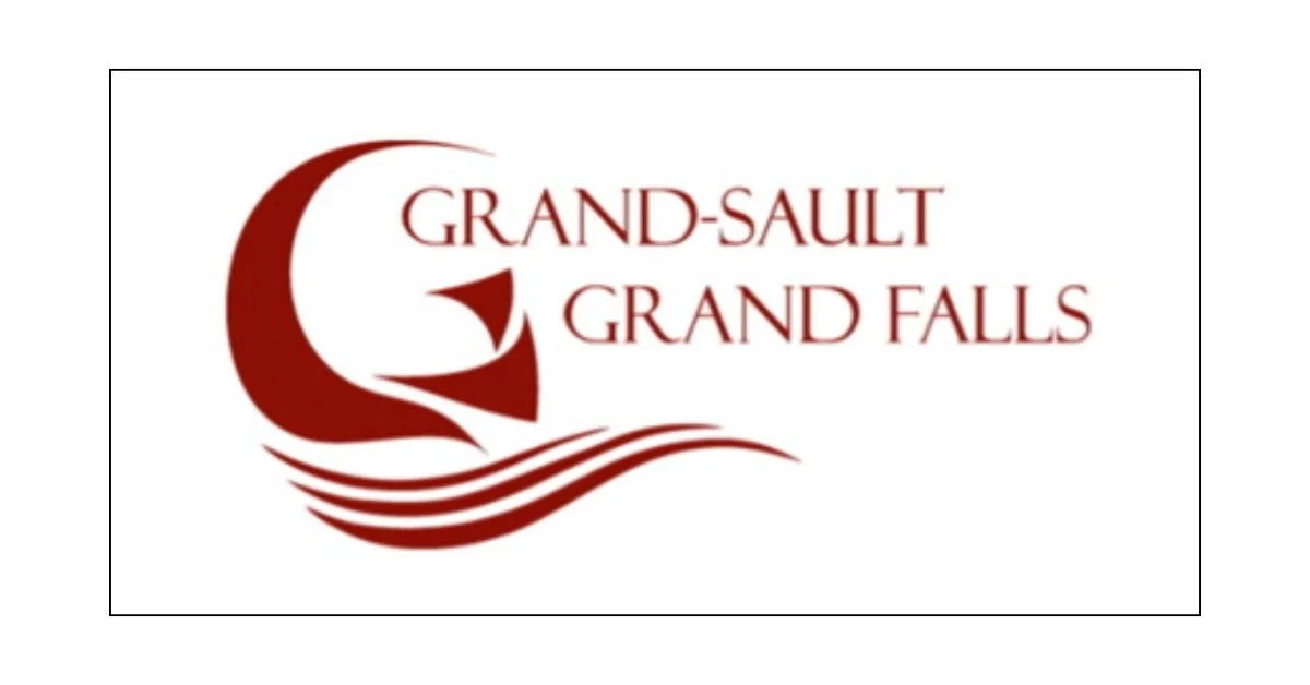
The flag of Grand Falls (Grand-Sault in French), New Brunswick, is a modern and stylized emblem that reflects the town's bilingual heritage, its iconic natural features, and its cultural identity. It is not a traditional flag in the heraldic or vexillological sense, but rather a civic banner that uses elements of the town’s visual identity to represent its people and history.
Dominated by a bold maroon color, the flag prominently displays the town’s name in both of Canada’s official languages: “Grand-Sault” and “Grand Falls.” This bilingual presentation underscores the community's strong Acadian and Anglophone roots, a hallmark of the region’s identity in northwestern New Brunswick. The symmetrical balance between the French and English names on the flag exemplifies the town’s commitment to inclusivity and linguistic equality.
To the left of the text is a large stylized “G” that forms part of a larger abstract design. This symbol is both letterform and imagery: the “G” also resembles a waterfall cresting over a rocky cliff — a nod to the town’s namesake and most famous natural feature, the Grand Falls of the Saint John River. The actual falls drop over 23 meters (75 feet), making them one of the most significant waterfalls east of the Rockies in Canada. This iconic cascade has played a major role in the town’s history, economy, and tourism.
Beneath the “G” are three curved lines that resemble both flowing water and waves. These elements reinforce the central theme of the falls and the river, evoking the power and continuity of nature. The lines also suggest motion, vitality, and the flow of time — appropriate for a town that has evolved through centuries from a key Indigenous site and Acadian settlement to a contemporary municipality.
The choice of the maroon-red hue throughout the flag is striking and meaningful. It conveys strength, energy, and a deep sense of place. Red is often associated with Canada, seen in the national flag, and here it helps connect the town to its broader provincial and national identities. At the same time, the uniqueness of the shade gives Grand Falls a distinct civic brand, differentiating it from other towns in the region.
Unlike many traditional municipal flags that include coats of arms, crests, or elaborate symbols, Grand Falls has opted for a minimalist and graphic approach. This aligns with contemporary trends in flag design, which favor clarity, symbolism, and visual impact over complexity. The flag could easily be recognized at a distance, and its elements are simple enough to be remembered and reproduced with ease — qualities considered essential by modern vexillological standards.
Overall, the flag of Grand Falls is a clean, modern design that captures the essence of the town: its powerful natural heritage, its commitment to bilingualism, and its forward-looking identity. By combining visual simplicity with symbolic depth, the flag represents both the place and the people of Grand Falls with elegance and strength.
Recently Posted

Categories
- Alberta 16
- Armed Forces 25
- British Columbia 15
- Canada 205
- Cities 101
- County / Municipality / Regional District / Township 3
- Government 13
- Historical 2
- Indigenous 27
- International Flags 41
- International Organizations 5
- Manitoba 10
- Miscellaneous 1
- New Brunswick 5
- Newfoundland 9
- Northwest Territories 4
- Nova Scotia 9
- Nunavut 6
- Ontario 24
- Police 1
- Prince Edward Island 5
- Quebec 39
- Royalty 9
- Saskatchewan 7
- Schools 5
- Sports 13
- Yukon 3