Maddington Falls, Quebec
The Flag of Maddington Falls, Quebec
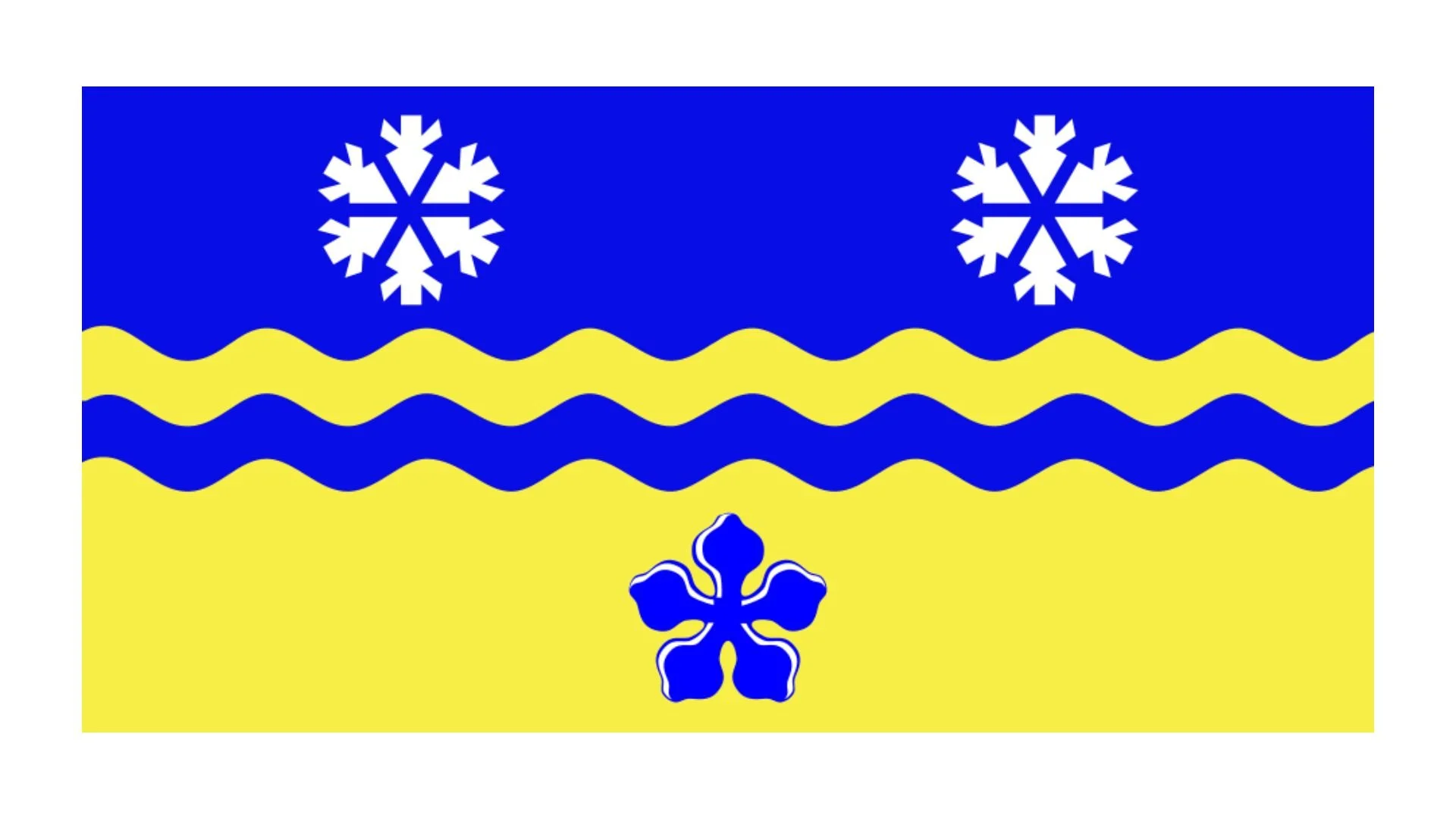
The flag of Maddington Falls, Quebec, is a vivid emblem that encapsulates the municipality’s natural beauty, heritage, and environmental values. Located in the Centre-du-Québec region, Maddington Falls is a small but proud community, and its flag is a strong visual representation of its identity and aspirations. The design, though simple at first glance, offers deep symbolism through its use of color, imagery, and motto.
The flag is primarily a green rectangle with a bold, cream-colored border. At its center is an illustration of a dam and a waterfall — a reference to the town’s name and history. The name “Maddington-Falls” appears prominently in white, uppercase letters on a green background to the right of the waterfall image. The font is clean and modern, suggesting forward-thinking values and a desire to stand out among Quebec’s many municipalities.
One of the most striking features of the flag is its stylized depiction of the natural environment. On the left side of the dam, a deer head, a pine tree, and a sheaf of wheat are drawn in gold and green. Each of these symbols speaks to different aspects of Maddington Falls’ character. The deer head represents the area’s rich wildlife and the importance of biodiversity. The pine tree is a classic Canadian symbol and reflects the abundant forests that surround the community. The sheaf of wheat points to agricultural roots and the value of hard work and rural life. These three icons are positioned in the same section as the dam, showing the town’s interconnectedness between human infrastructure and the natural world.
The dam and waterfall are not just literal references to the physical Maddington Falls; they also symbolize energy, movement, and sustainability. The image suggests a respect for natural resources and a dedication to preserving the environment while harnessing its power responsibly. The cascading water depicted in shades of blue adds visual dynamism and reinforces the idea of the community being energized and ever-flowing with life.
Beneath the image, in bold black letters, is the town’s slogan: Briller par son écosystème, which translates to “Shining through its ecosystem.” This motto is particularly revealing of Maddington Falls’ values. Rather than highlighting economic prowess or historical fame, the municipality chooses to shine through its ecosystem, emphasizing sustainability, environmental stewardship, and harmony with nature as its core ideals. It’s a progressive and thoughtful slogan, suggesting a vision for the future rooted in ecological balance.
The overall aesthetic of the flag is clean and structured, using geometric shapes and strong colors to communicate its message clearly. The green background symbolizes growth, health, and nature, while the yellow and gold tones add warmth and optimism. The blue waterfall brings a refreshing coolness, breaking up the warmer hues and adding balance.
Recently Posted

Categories
- Alberta 16
- Armed Forces 25
- British Columbia 15
- Canada 205
- Cities 101
- County / Municipality / Regional District / Township 3
- Government 13
- Historical 2
- Indigenous 27
- International Flags 41
- International Organizations 5
- Manitoba 10
- Miscellaneous 1
- New Brunswick 5
- Newfoundland 9
- Northwest Territories 4
- Nova Scotia 9
- Nunavut 6
- Ontario 24
- Police 1
- Prince Edward Island 5
- Quebec 39
- Royalty 9
- Saskatchewan 7
- Schools 5
- Sports 13
- Yukon 3