Mascouche, Quebec
Flag of Mascouche, Quebec
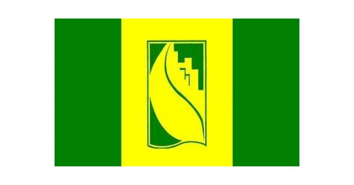
The flag of Mascouche, Quebec, is a symbol of the town’s identity, heritage, and aspirations. Designed with a stylized logo, the flag encapsulates the natural beauty, economic potential, and demographic growth of Mascouche. Every element within the design holds significance, reinforcing the town’s commitment to progress while respecting its geographical and historical context.
At the heart of the flag’s design is a stylized representation of a growing tree and the letter "M." This dual symbolism reflects Mascouche’s dedication to both nature and its community. The tree embodies growth, vitality, and sustainability, while the letter "M" serves as a direct reference to the town’s name. The logo is rendered in a three-dimensional style, emphasizing the rapid demographic growth that Mascouche has experienced over the years. This modern, forward-looking design reflects a town that is evolving while maintaining its deep-rooted connection to nature.
Another key aspect of the flag’s design is the well-defined angles of the logo, which contribute to a sense of dynamism and movement. These angles highlight Mascouche’s progressive spirit and its continuous development. Additionally, the emblem is divided into two levels, symbolizing the town’s two terraces. These terraces are an essential aspect of Mascouche’s topography, historically shaping the settlement and infrastructure of the area. Today, the two terraces are connected by Boulevard Mascouche, a vital roadway that unites different sections of the town and facilitates growth and communication.
An important visual element in the flag’s design is the darkest fimbriation, or border, which connects the two levels of the emblem. This element represents the Grand Côteau, or Big Hillside, a defining geomorphological feature of Mascouche. The Grand Côteau has played a crucial role in shaping the landscape of the town, and its inclusion in the flag’s design pays homage to the natural environment that influences the town’s character and development.
The color scheme of the flag further reinforces its symbolism. The primary colors used are forest green and golden yellow, each representing key aspects of Mascouche. The forest green symbolizes the lush plant canopy that thrives on the upper terrace of the town. This color choice reflects Mascouche’s rich natural environment and the importance of preserving its green spaces. On the other hand, the golden yellow signifies the economic potential located in the downtown area. This hue represents prosperity, energy, and the vibrancy of the town’s commercial and business sectors.
Together, these design elements create a cohesive representation of Mascouche’s essence. The flag serves as a visual reminder of the town’s past, present, and future, blending natural beauty with urban development. It highlights Mascouche’s commitment to sustainability, economic growth, and community cohesion. As a result, the flag of Mascouche stands as more than just a municipal emblem; it is a declaration of the town’s identity and aspirations for a prosperous future.
Recently Posted
Categories
- Alberta 12
- Armed Forces 19
- British Columbia 9
- Canada 159
- Cities 78
- County / Municipality / Regional District / Township 2
- Government 11
- Historical 2
- Indigenous 21
- International Flags 32
- International Organizations 3
- Manitoba 6
- New Brunswick 4
- Newfoundland 8
- Northwest Territories 4
- Nova Scotia 6
- Nunavut 6
- Ontario 15
- Police 1
- Prince Edward Island 4
- Quebec 29
- Royalty 8
- Saskatchewan 7
- Schools 2
- Sports 8
- Yukon 2
