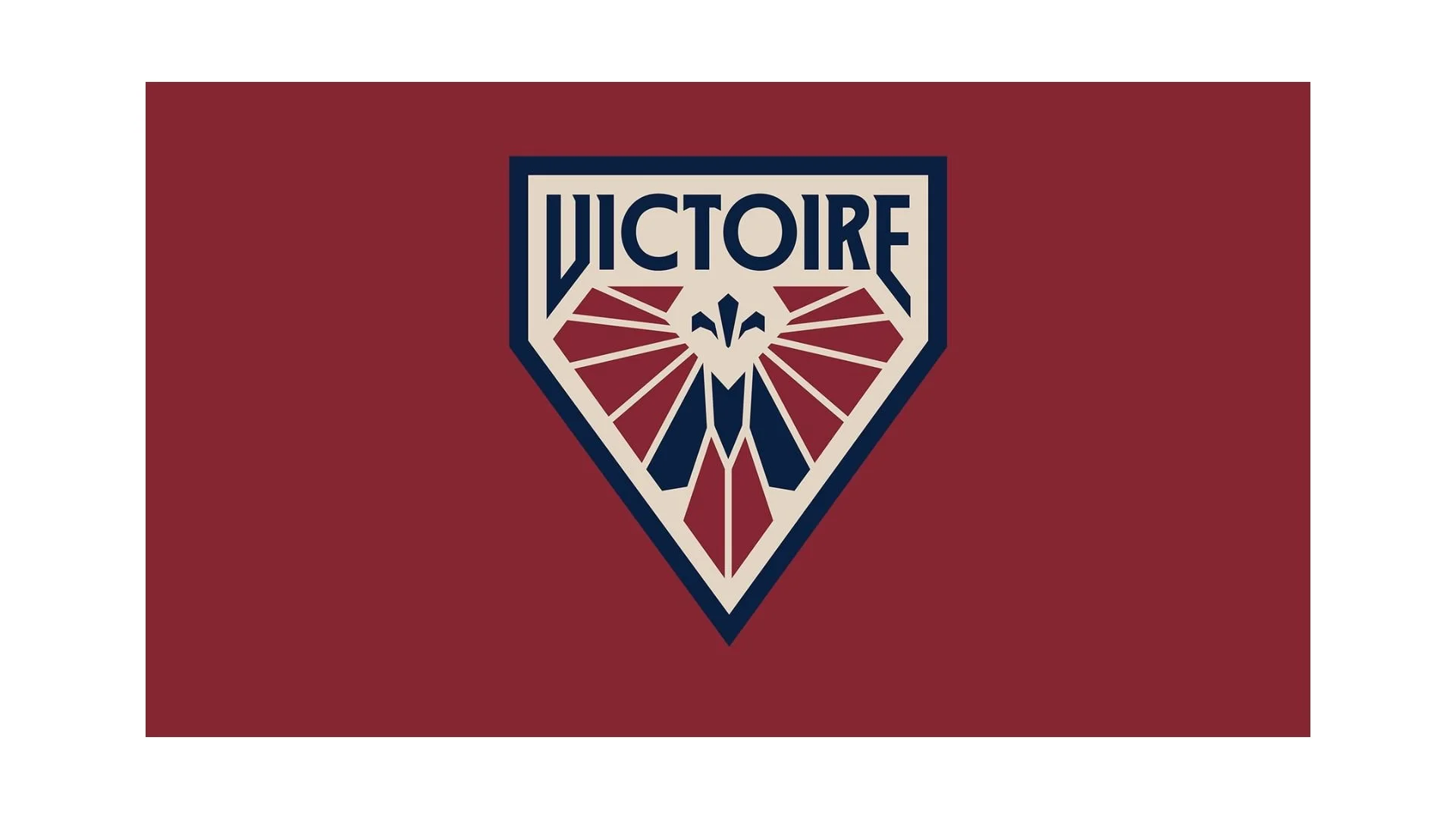
The flag of Montreal Victoire
The Montréal Victoire, a cornerstone franchise of the Professional Women’s Hockey League (PWHL), carries an identity that is both a tribute to its home province and a bold statement of its future. While the organization’s history is brief, beginning with the league’s launch in 2023, its branding—most notably its flag and crest—draws from centuries of cultural and sporting tradition in Québec. The Victoire flag is more than a team banner; it is a meticulously designed emblem of "triumph as a mindset," blending Art Deco aesthetics with powerful regional symbols.
The Montréal Victoire was founded on August 29, 2023, as one of the "Inaugural Six" charter franchises of the PWHL. During its first season (2023–24), the team operated without a formal nickname, simply known as "PWHL Montréal". Despite the lack of branding, the team immediately became a powerhouse, led by legendary captain Marie-Philip Poulin and general manager Danièle Sauvageau.
The inaugural season was defined by record-breaking attendance, including the historic "Duel at the Top" at the Bell Centre, which saw 21,105 fans—the largest crowd to ever witness a women's professional hockey game. Following a successful regular season where they finished near the top of the standings, the league officially unveiled the "Victoire" identity on September 9, 2024, ahead of the second season. The name was chosen to reflect Montréal’s "joyously competitive spirit" and its deep-rooted history of hockey success.
The flag of the Montréal Victoire prominently features the team's primary crest, a shield-shaped emblem that utilizes an Art Deco motif. This design choice evokes a sense of "style and savoir-faire," grounding the modern team in a timeless aesthetic.
At the heart of the flag are stylized wing-like shapes, a direct allusion to the Greek goddess Nike—the Goddess of Victory. These "Wings of Triumph" symbolize strength, agility, and the upward trajectory the team aims for. The wings are composed of sharp, geometric segments that imply "coiled kinetic power," suggesting movement and intensity even in a static image.
The flag masterfully integrates local heritage through "hidden" motifs. A deep blue "M" is cleverly embedded within the structure of the wings, serving as a constant homage to Greater Montréal. Perched at the very top of the crest is a fleur-de-lis, the national symbol of Québec. This inclusion was deemed essential by designers and fans alike to ensure the team felt authentically rooted in the cultural history of the province.
The word "VICTOIRE" is emblazoned across the top of the crest in a custom, sophisticated font that matches the Art Deco style of the wings. Notably, the league chose to keep the team name exclusively in French—both at home and on the road—to represent the unique Francophone identity of the city.
The colors of the Victoire flag are a deliberate departure from the traditional "Bleu-Blanc-Rouge" of the Montréal Canadiens, though they still "wave to" that heritage. The anchor of the palette, this deep red represents the city's "unwavering passion for victory" and its rich sporting heritage. A sophisticated beige used for the background of the crest, providing a vintage, "elevated" feel. Added as an accent color in the second season, this deep blue forms the "M" and the border of the shield, adding depth and versatility to the branding.
The flag of the Montréal Victoire is a sophisticated blend of myth and reality. By combining the legendary wings of a goddess with the "M" of their city and the fleur-de-lis of their province, the organization has created a symbol that commands respect. As the team continues to climb the PWHL standings, this banner stands as a testament to a city that views victory not just as a goal, but as a way of life.
Recently Posted



Categories
- Alberta 28
- Armed Forces 40
- British Columbia 26
- Canada 333
- Cities 160
- County / Municipality / Regional District / Township 8
- General Information 2
- Government 18
- Historical 4
- Indigenous 42
- International Flags 58
- International Organizations 5
- Manitoba 18
- Miscellaneous 4
- New Brunswick 10
- Newfoundland 12
- Northwest Territories 7
- Nova Scotia 14
- Nunavut 6
- Ontario 42
- Police 1
- Prince Edward Island 5
- Quebec 77
- Royalty 16
- Saskatchewan 16
- Schools 13
- Sports 28
- Yukon 5