Robert-Cliche, Quebec
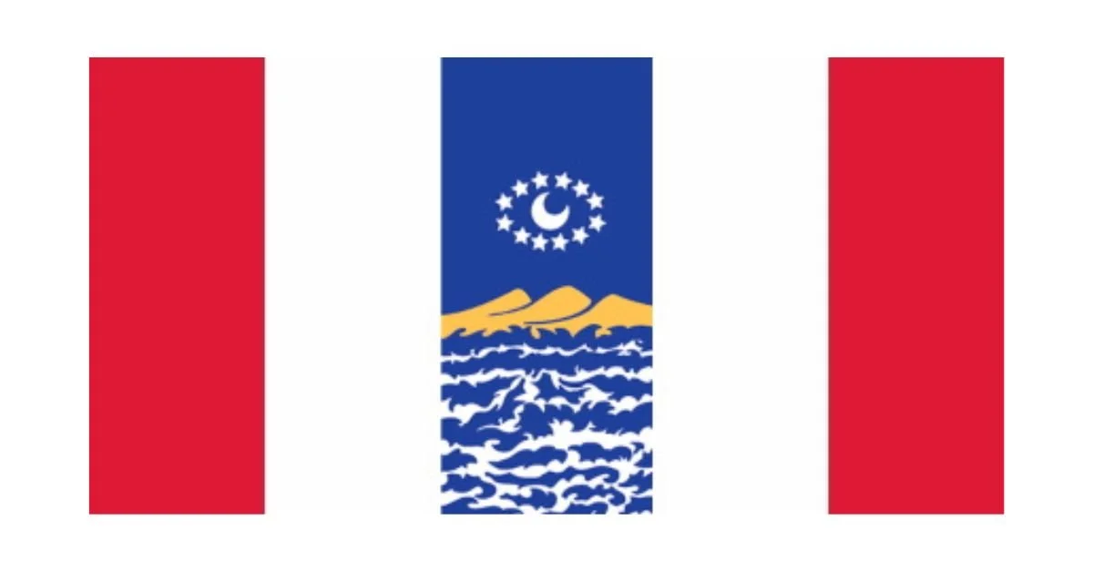
Flag of Robert-Cliche, Quebec
While not a traditional flag, the emblem of the MRC Robert-Cliche in Quebec serves as a visual representation of the region’s identity, culture, and natural beauty. The design consists of a circular emblem depicting a stylized rural landscape, featuring rolling green hills, a church steeple, small buildings, and a flowing river or road. The background sky includes soft clouds, reinforcing the serene and picturesque quality of the region. Below the emblem, the text "MRC Robert-Cliche" appears in an elegant, slightly wavy font, with "MRC" in blue and "Robert-Cliche" in green.
The various elements of the design collectively symbolize the region’s rich history, natural environment, and strong community ties. The rolling green hills emphasize the agricultural roots of the area, highlighting the importance of farming and rural life to its residents. Agriculture has historically played a significant role in Quebec’s economy, and the inclusion of these hills serves as a nod to the region’s hardworking farming communities.
At the center of the emblem, the church steeple stands prominently, representing the deep cultural and historical influence of Catholicism in Quebec. Churches have long been the heart of many small towns and villages in the province, serving not just as places of worship but also as community gathering spaces. The steeple in the logo signifies both spiritual heritage and the architectural landscape that defines many Quebecois towns.
The small buildings surrounding the church add to the sense of community and rural charm. These structures could represent homes, businesses, or municipal buildings, reinforcing the idea that Robert-Cliche is a place where people live, work, and come together. The inclusion of these buildings within the circular design suggests unity and cohesion, values that are often at the core of small-town life.
Another key element in the emblem is the flowing river or road that winds through the landscape. This feature symbolizes movement, connectivity, and the passage of time. If interpreted as a river, it highlights the significance of waterways in the development of settlements and economic activities in Quebec. If seen as a road, it reflects the importance of infrastructure and transportation in linking communities and fostering economic growth.
The use of color further enhances the emblem’s message. Green dominates the design, signifying nature, agriculture, and sustainability. Blue, found in both the sky and the "MRC" lettering, is often associated with water, tranquility, and trust. The harmonious combination of these colors evokes a sense of balance between progress and preservation, demonstrating a commitment to both economic development and environmental stewardship.
Recently Posted
Categories
- Alberta 15
- Armed Forces 23
- British Columbia 13
- Canada 190
- Cities 93
- County / Municipality / Regional District / Township 2
- Government 13
- Historical 2
- Indigenous 25
- International Flags 39
- International Organizations 4
- Manitoba 9
- New Brunswick 4
- Newfoundland 9
- Northwest Territories 4
- Nova Scotia 8
- Nunavut 6
- Ontario 19
- Police 1
- Prince Edward Island 4
- Quebec 38
- Royalty 9
- Rural Municipality 1
- Saskatchewan 7
- Schools 4
- Sports 11
- Yukon 3
