Shediac Bay Yacht Club
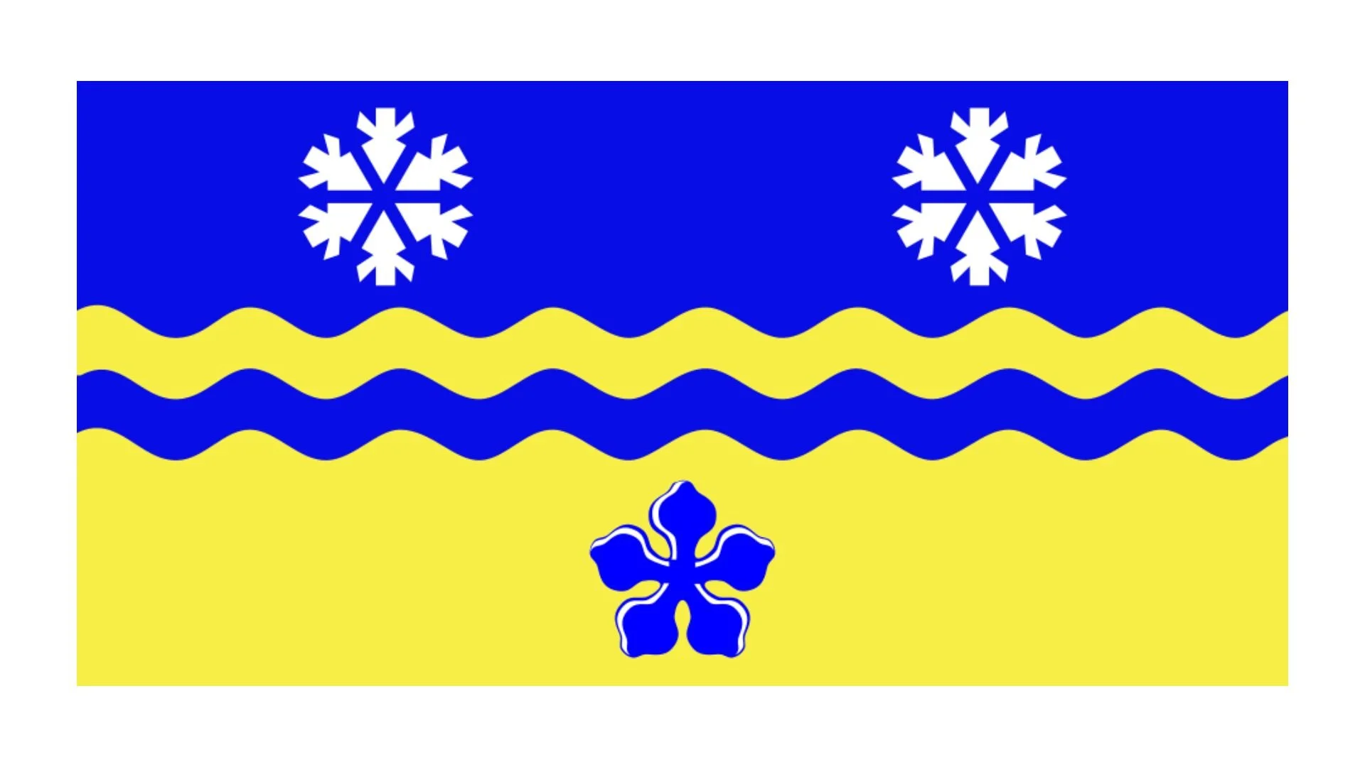
Sheldiac Bay Yacht Club Burgee
The burgee of the Shediac Bay Yacht Club (SBYC) is a striking representation of the club’s maritime heritage and its bilingual, seafaring community. Featuring a horizontal bi-colour design of red and blue, the burgee is centered around a white lighthouse enclosed within a white eight-handle ship’s wheel. The letters “S” (red), “B” (blue), “Y” (red), and “C” (blue) are inscribed in the wheel’s upper quadrant, while the lower quadrant mirrors this arrangement with “Y” (blue), “C” (red), “B” (blue), and “S” (red), signifying both the English and French names of the club: Shediac Bay Yacht Club and Yacht Club de la Baie de Shediac.
This emblematic flag captures the rich sailing traditions of Shediac Bay, a coastal area known for its strong nautical culture and vibrant sailing community. The red and blue horizontal divisions are not just decorative but symbolize unity and the dynamic spirit of sailing. Red, often associated with passion and energy, reflects the enthusiasm and commitment of SBYC members to their maritime pursuits. Blue, commonly linked to the sea and tranquility, signifies the club’s connection to the waters of the Northumberland Strait.
At the heart of the burgee, the white lighthouse serves as a beacon of guidance, safety, and community. Lighthouses have historically played an essential role in maritime navigation, warning sailors of coastal dangers and guiding them safely to shore. Its placement at the center of the ship’s wheel reinforces its importance to sailors and boaters, acting as a metaphor for leadership, direction, and stability. The lighthouse also reflects the club’s mission to foster seamanship, safety, and a love for sailing among its members.
Encircling the lighthouse, the white ship’s wheel with eight handles is a universal symbol of maritime tradition, steering, and control. It represents the skilled sailors and navigators who take to the waters of Shediac Bay, emphasizing their ability to chart their course with precision and expertise. Additionally, the inclusion of both English and French initials in alternating colors highlights the bilingual nature of the club and its inclusive spirit. This feature acknowledges Shediac’s cultural heritage, where French and English communities coexist harmoniously, united by their shared passion for the sea.
The strategic use of lettering, with “S,” “B,” “Y,” and “C” appearing in the upper quadrant and “Y,” “C,” “B,” and “S” in the lower, further reinforces the club’s identity. The mirrored arrangement of the letters ensures equal representation of both language groups and creates a sense of balance and symmetry, which is both visually appealing and symbolically meaningful.
Recently Posted


Categories
- Alberta 16
- Armed Forces 25
- British Columbia 15
- Canada 207
- Cities 102
- County / Municipality / Regional District / Township 3
- Government 13
- Historical 2
- Indigenous 27
- International Flags 41
- International Organizations 5
- Manitoba 10
- Miscellaneous 1
- New Brunswick 5
- Newfoundland 9
- Northwest Territories 4
- Nova Scotia 9
- Nunavut 6
- Ontario 25
- Police 1
- Prince Edward Island 5
- Quebec 40
- Royalty 9
- Saskatchewan 7
- School 1
- Schools 5
- Sports 13
- Yukon 3