Universite de Montreal
The flag of the Universite de Montreal
The Université de Montréal (UdeM), one of Quebec’s leading French‑language research universities, is associated with several official symbols: a coat of arms, a logo, and a flag. The flag in its present form was adopted on 24 May 1994 by the university’s Executive Committee. It combines tradition and modern identity, bridging the university’s historical roots and its contemporary mission.
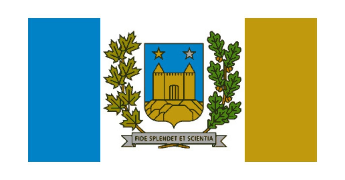
The flag features the coat of arms of Université de Montréal centred on a field composed of coloured bands, “bleu et or” (blue and gold). Specifically, the design is a Canadian pale layout: a central vertical stripe (the pale) bearing the coat of arms, flanked by coloured panels in the arms’ colours. The left (hoist) band is blue, and the right (fly) band is gold. The central pale is typically white in many examples, allowing the coat of arms (which itself incorporates blue, gold, and silver) to stand out.
In addition, there is also a “logo flag” variant: units affiliated with the university that wish to emphasize that relationship may fly a simpler flag bearing the university’s white logo on a solid blue field.
To understand the flag fully, one must appreciate the coat of arms (blason) that it displays. The arms were originally designed in 1920 by vice‑rector Mgr Émile Chartier, with finalization by Victor Morin. They were modernized in 1993 to the version now in use.
The shield (écusson) shows Mount Royal in its lower section, surmounted by a fort with two turrets—this recalls the Fort of the Sulpicians (“Fort des Messieurs de Saint‑Sulpice”) that once bordered lands belonging to the Grand Seminary in Montréal. These elements evoke the origins of higher education in the city and the university's heritage.
Above this are two stars, one gold (or) and one silver (argent), representing “faith” and “science” respectively, reflecting the university’s motto Fide splendet et scientia (“She shines by faith and knowledge/science”). Surrounding the shield are two branches—on the left, a branch of maple leaves (érable) reminding us of Canada; on the right, a branch of oak leaves (chêne), signifying institutional strength.
The university’s arms were adopted shortly after its autonomy from Université Laval in 1920, when it became fully independent as an institution. Over time, as visual branding and symbolic representation became more important, the flag was introduced in 1994, bringing together the historical arms with the university’s official colours in a formal banner.
Even earlier, in the 1980s, a different flag or standard had been used: a dark blue background with a yellow logo representing the central tower and letters “UM”. That logo-centred flag is still used in affiliated units or in less formal contexts.
The flag is much more than a mere decoration. It is a visible symbol of institutional pride, unity, and identity. At ceremonies, official events, and in front of university buildings, it confirms the place of UdeM in both the academic and civic life of Montreal and Quebec. It reminds students, faculty, staff, alumni, and visitors of the deep historical roots of the university—even in its religious and missionary origins—and its continual dedication to faith and science, knowledge and moral purpose.
Moreover, by combining modern graphical standards (such as its branding colours and versions of the logo flag) with the traditional coat of arms, UdeM’s flag reflects how academic institutions balance heritage with evolution. It is both a marker of legacy and a canvas of belonging in the present.
Recently Posted

Categories
- Alberta 25
- Armed Forces 37
- British Columbia 22
- Canada 301
- Cities 146
- County / Municipality / Regional District / Township 6
- Government 17
- Historical 3
- Indigenous 38
- International Flags 54
- International Organizations 5
- Manitoba 17
- Miscellaneous 4
- New Brunswick 7
- Newfoundland 12
- Northwest Territories 5
- Nova Scotia 13
- Nunavut 6
- Ontario 40
- Police 1
- Prince Edward Island 5
- Quebec 68
- Royalty 13
- Saskatchewan 13
- Schools 12
- Sports 24
- Yukon 4