Chipman, New Brunswick
The flag of Chipman, New Brunswick
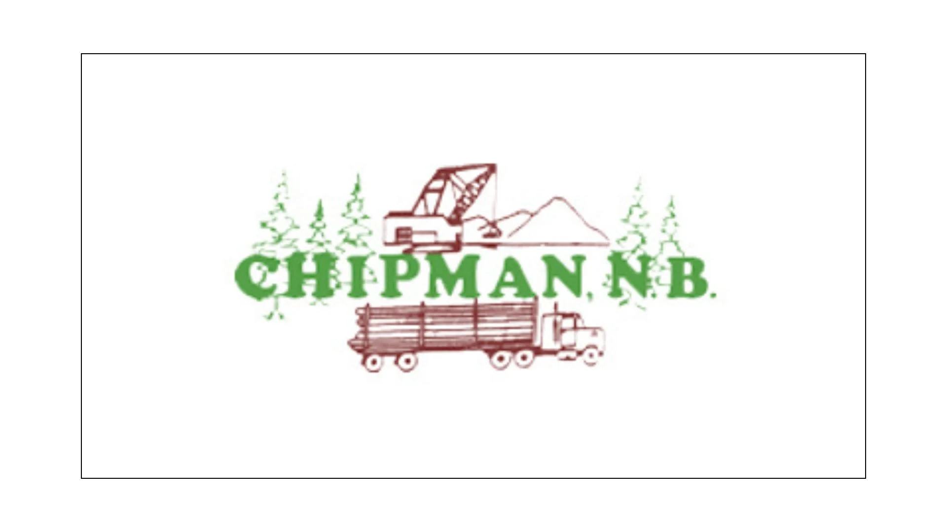
The flag of Chipman, New Brunswick, reflects the village’s deep roots in forestry, industry, and rural resilience, presenting a visual identity grounded in work, landscape, and community pride. Set against a clean white field, the design is straightforward yet evocative, allowing its central imagery and lettering to stand out clearly. Rather than relying on abstract symbolism, the flag of Chipman tells a direct story about how the community came to be and what has sustained it over generations.
Dominating the design is the name “CHIPMAN N.B.” rendered in bold green lettering. The choice of green is immediately suggestive of the forests that surround the village and have long defined its economic and cultural life. Chipman developed as a forestry and milling community, and the colour green naturally evokes growth, renewal, and the dense woodlands that fueled its early prosperity. The text itself is prominent and confident, emphasizing local identity and ensuring the community’s name is inseparable from the imagery that accompanies it.
Above the lettering appears a piece of heavy equipment, a mechanical excavator, while below it sits a logging truck loaded with timber. These two elements together form the heart of the flag’s symbolism. The excavator represents industrial labour, development, and the transformation of raw land into usable infrastructure. It speaks to the effort required to build and maintain a working community in a rural part of New Brunswick, where industry and perseverance have always gone hand in hand. The logging truck reinforces this message, directly referencing the forestry industry that has been central to Chipman’s economy for decades. Timber harvesting, transport, and processing shaped not only employment but also the rhythms of daily life in the village.
Scattered evergreen trees frame the central text and machinery, softening the industrial imagery and placing it firmly within a natural context. These trees serve as a reminder that Chipman’s identity is rooted in a balance between human labour and the surrounding environment. The forest is not merely a resource but a defining feature of the landscape, offering both livelihood and a sense of place. By including trees alongside machinery, the flag acknowledges the interdependence of nature and industry rather than presenting them as opposing forces.
The white background of the flag plays an important supporting role. White provides clarity and contrast, allowing the green and brown tones of the imagery to remain visually strong without distraction. Symbolically, it can be read as openness and honesty, reflecting the straightforward, no-nonsense character often associated with small rural communities. There is little ornamentation in the design, reinforcing the idea that Chipman values substance over flourish.
Taken as a whole, the flag of Chipman is less about heraldic tradition and more about lived experience. It celebrates work, resourcefulness, and connection to the land, presenting a clear and unapologetic portrait of a village shaped by forestry and industry. Rather than abstract ideals, the flag honours the tangible realities that built Chipman and continue to define it. As a civic symbol, it stands as a proud acknowledgment of the community’s past and a steady affirmation of its enduring identity in the heart of New Brunswick.
Recently Posted

Categories
- Alberta 25
- Armed Forces 37
- British Columbia 22
- Canada 302
- Cities 147
- County / Municipality / Regional District / Township 6
- Government 17
- Historical 3
- Indigenous 38
- International Flags 54
- International Organizations 5
- Manitoba 17
- Miscellaneous 4
- New Brunswick 8
- Newfoundland 12
- Northwest Territories 5
- Nova Scotia 13
- Nunavut 6
- Ontario 40
- Police 1
- Prince Edward Island 5
- Quebec 68
- Royalty 13
- Saskatchewan 13
- Schools 12
- Sports 24
- Yukon 4