Varennes, Quebec
The Flag of Varennes, Quebec
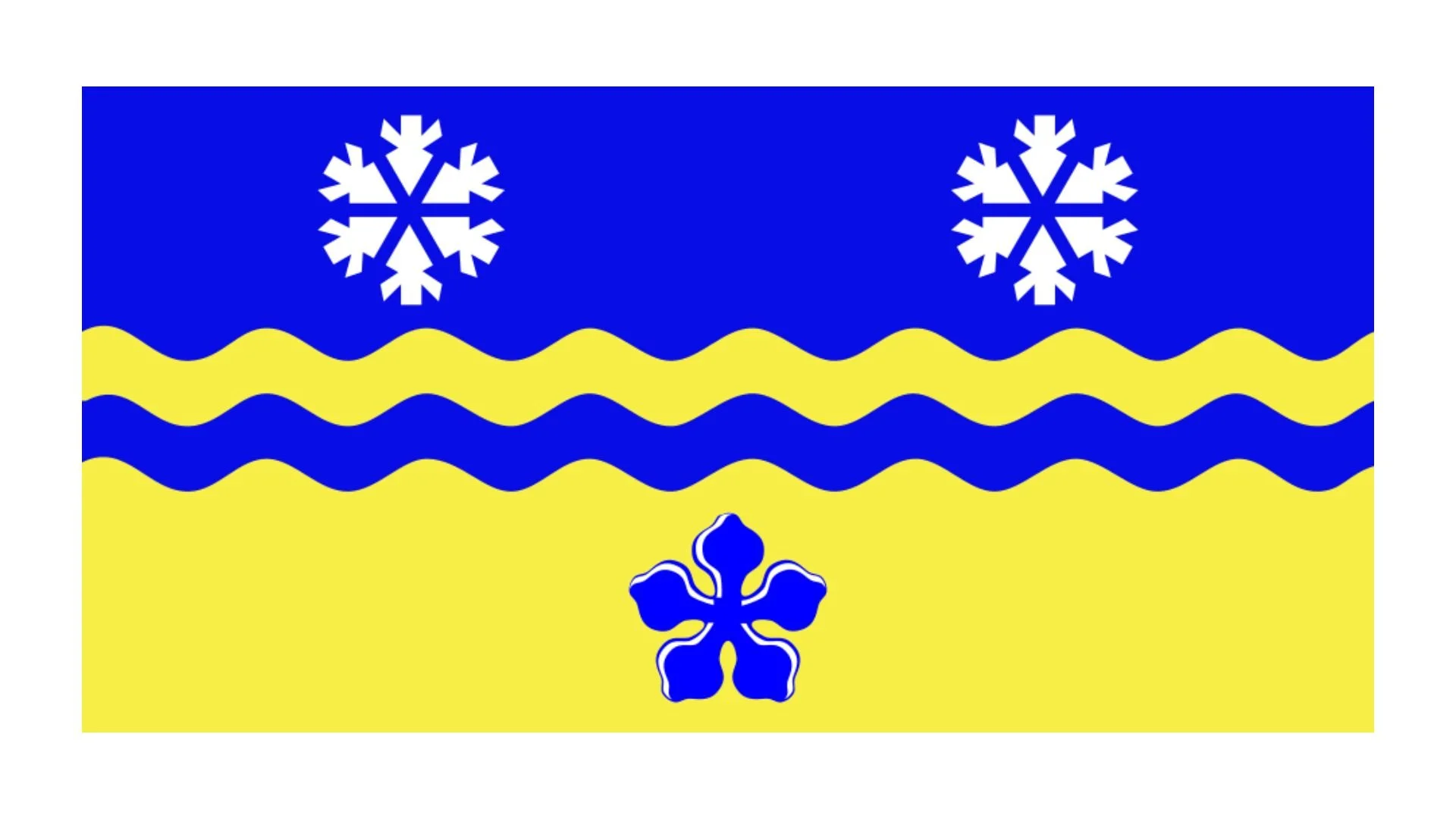
The flag of Varennes, Quebec, is a striking representation of the town’s identity, values, and aspirations. While Varennes has a coat of arms, its flag stands apart with a more modern and symbolic design, reflecting the town’s connection to both its natural environment and its forward-looking vision. The flag is simple, yet powerful in its symbolism, utilizing the town's logotype as its central feature. This logotype not only serves as a visual representation of Varennes but also communicates the town's dynamic character, historical richness, and relationship with its environment.
The flag is predominantly white, providing a clean and neutral background that allows the logotype to stand out clearly. The central element of the flag is an isosceles triangle, which serves a dual purpose. First, it symbolizes stability, conveying the sense of a grounded and secure community. Second, the triangle forms the letter "V," an immediate reference to the name of the municipality, Varennes, while also symbolizing an openness to the future. The use of this shape is not only a visual identifier for the town but also represents the desire for progress and development, a key aspect of Varennes’ identity as a growing and evolving community.
The points of the triangle, which are curved, add further layers of meaning to the flag’s design. On one side, the curved points evoke the image of water, a nod to Varennes’ location on the southern bank of the Saint Lawrence River. The river has been a significant part of the town’s history and continues to play an important role in its economy and lifestyle. On the other side, the curves represent the rural territory of Varennes, emphasizing the town’s deep connection to its agricultural roots and the natural beauty that surrounds it. The crossing of these curves forms a bird, symbolizing humanity. This bird represents the people of Varennes, symbolizing their spirit, unity, and shared purpose.
The repetition of the curved points in the design is also significant. It suggests the town’s dynamism, energy, and constant movement. Varennes is a community that is not static but continuously evolving. The repeated points represent the drive for progress, growth, and the vitality that defines Varennes as it moves into the future.
The colors used in the flag further enhance its symbolic meaning. The blue of the logotype represents both confidence and the omnipresent river. The river is central to the town’s identity and serves as a symbol of continuity, life, and connection. Blue, as a color, is also associated with trust and stability, qualities that the town aims to foster as it grows. The ochre color, in contrast, represents the richness of the town’s heritage and its vast rural territory. Ochre, a warm and earthy tone, reflects the agricultural history of the region and the deep ties that Varennes has to its land.
Varennes itself is located in the MRC Lajemmerais in the Montérégie region of Quebec, on the southern bank of the Saint Lawrence River. This location plays a pivotal role in the town’s history and development, contributing to its character as a blend of natural beauty and modern progress.
Recently Posted


Categories
- Alberta 16
- Armed Forces 25
- British Columbia 15
- Canada 207
- Cities 102
- County / Municipality / Regional District / Township 3
- Government 13
- Historical 2
- Indigenous 27
- International Flags 41
- International Organizations 5
- Manitoba 10
- Miscellaneous 1
- New Brunswick 5
- Newfoundland 9
- Northwest Territories 4
- Nova Scotia 9
- Nunavut 6
- Ontario 25
- Police 1
- Prince Edward Island 5
- Quebec 40
- Royalty 9
- Saskatchewan 7
- Schools 6
- Sports 13
- Yukon 3