Boyle, Alberta
The Flag of Boyle, Alberta
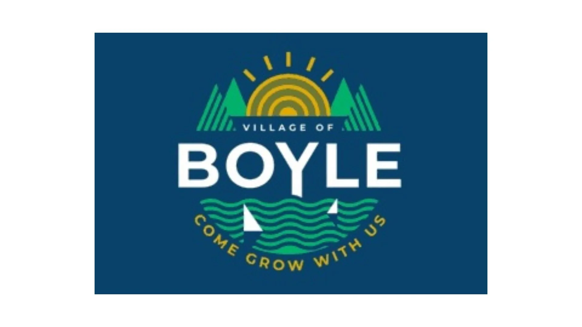
The flag of Boyle, Alberta is a modern municipal banner that reflects the village’s identity, values, and aspirations through clean design and symbolic imagery. Unlike traditional heraldic flags that rely on shields and crests, Boyle’s flag adopts a contemporary graphic style, emphasizing approachability, growth, and connection to the natural environment. The result is a flag that feels current while still rooted in the community’s prairie setting and rural heritage.
The background of the flag is a deep blue, a colour often associated with stability, trust, and open skies. In the context of Boyle, the blue field evokes Alberta’s expansive horizons and the calm reliability of a close-knit rural community. This strong backdrop allows the central design to stand out clearly, ensuring visibility whether the flag is flown outdoors or displayed at civic events.
At the heart of the flag is a circular emblem containing several key elements. Dominating the upper portion is a stylized rising sun, rendered in warm yellow and gold tones. The sun is a powerful symbol of optimism, renewal, and opportunity. For Boyle, it suggests forward momentum and a welcoming outlook, reinforcing the idea of the village as a place where new beginnings are encouraged and growth is possible.
Beneath the sun sit green triangular shapes resembling hills or fields, representing the surrounding agricultural landscape. Agriculture has long played an essential role in Boyle’s development, and these shapes symbolize cultivated land, productivity, and the deep connection between residents and the land they work. The use of green also conveys sustainability, renewal, and respect for the natural environment.
Flowing across the lower part of the emblem are curving wave-like lines, suggesting water, movement, and continuity. These lines can be interpreted as representing nearby waterways, as well as the ongoing flow of community life. They add a sense of motion to the design, balancing the solid shapes above with softer, organic forms. Together, the hills and waves create a visual harmony between land and water, two foundational elements of rural life in Alberta.
Prominently displayed in bold white lettering are the words “Village of Boyle”, ensuring immediate recognition and reinforcing civic identity. The use of white provides strong contrast against the dark background, symbolizing clarity, openness, and honesty in local governance. Below the village name appears the motto “Come Grow With Us.” This phrase encapsulates the spirit of Boyle: an invitation to newcomers, families, and businesses to become part of a supportive and evolving community. The word “grow” carries layered meaning, referencing both agricultural roots and personal or economic development.
Overall, the flag of Boyle succeeds in blending modern design with meaningful symbolism. It avoids unnecessary complexity while clearly communicating who Boyle is and what it stands for. Rather than focusing solely on the past, the flag looks ahead, presenting Boyle as a village grounded in its landscape yet open to change and opportunity.
Recently Posted
Categories
- Alberta 25
- Armed Forces 37
- British Columbia 22
- Canada 298
- Cities 145
- County / Municipality / Regional District / Township 6
- Government 17
- Historical 3
- Indigenous 37
- International Flags 54
- International Organizations 5
- Manitoba 17
- Miscellaneous 4
- New Brunswick 7
- Newfoundland 12
- Northwest Territories 5
- Nova Scotia 13
- Nunavut 6
- Ontario 39
- Police 1
- Prince Edward Island 5
- Quebec 66
- Royalty 13
- Saskatchewan 13
- Schools 11
- Sports 24
- Yukon 4