The flag of Farnham, Quebec
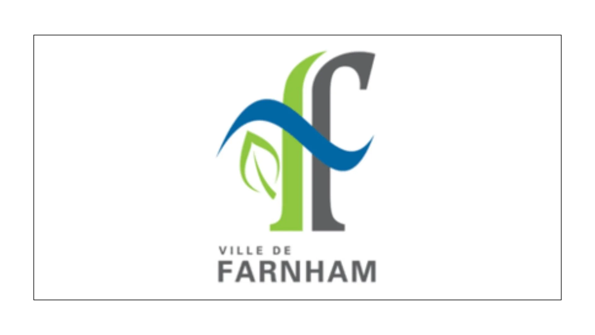
The flag of Farnham, Quebec, serves as a modern visual narrative, distilling the community's rich industrial past, its scenic natural landscape, and its forward-looking aspirations into a single, cohesive emblem. Unlike traditional heraldic banners, Farnham’s primary flag features the city's stylized logo on a white field, a design adopted in September 2013 to provide a unique and easily recognizable identity. This symbol acts as a bridge between the "builders of the town" and its modern-day "ecological vision".
The city of Farnham takes its name from the historic Township of Farnham, established before 1800 and named in remembrance of Farnham, Surrey, in England. The first "Farnhamiens" were predominantly Loyalists from the United States who arrived around 1800.
Farnham's development was deeply tied to its geography and industry. In 1817, Whipple Cook built a sawmill on the south bank of the Yamaska River, marking the beginning of the area's industrial growth. The city is historically known as a "railway town". The arrival of the Champlain & St-Lawrence Railway connecting Laprairie and Saint-Jean-Dorchester significantly boosted its local economy. On March 8, 2000, the former Town of Farnham merged with the municipality of Rainville to form the current City of Farnham.
The flag's central feature is a stylized letter "F", which is meticulously designed to represent different facets of the community's identity. The "F" is split vertically by a white line, which represents the railway that has defined the town's history since its founding in 1876. The right half of the "F" is colored coal gray, symbolizing the importance of the train history and industrial heritage that built the foundation of the territory. The left half is green, representing the city’s ecological vision, sustainable development, and its surrounding agricultural environment.
The logo is divided horizontally by a fluid blue wave. This represents the Yamaska River, which geographically divides the town into east and west sections. Blue also serves as a broader symbol for calm, wisdom, and liberty. A small green leaf is integrated into the design, positioned within the left part of the "F". This leaf symbolizes youth and the city's commitment to ensuring that the next generation grows up "happy, healthy, and proud to be Farnhamians".
As Farnham prepares to celebrate its 150th anniversary in 2026, these symbols continue to play a vital role in municipal life, appearing on everything from official city signage to community event banners.
Recently Posted

Categories
- Alberta 27
- Armed Forces 40
- British Columbia 26
- Canada 327
- Cities 157
- County / Municipality / Regional District / Township 8
- General Information 1
- Government 18
- Historical 4
- Indigenous 41
- International Flags 58
- International Organizations 5
- Manitoba 18
- Miscellaneous 4
- New Brunswick 9
- Newfoundland 12
- Northwest Territories 7
- Nova Scotia 14
- Nunavut 6
- Ontario 41
- Police 1
- Prince Edward Island 5
- Quebec 74
- Royalty 16
- Saskatchewan 15
- Schools 13
- Sports 27
- Yukon 5