Penticton, British Columbia
The Flag of Penticton, British Columbia
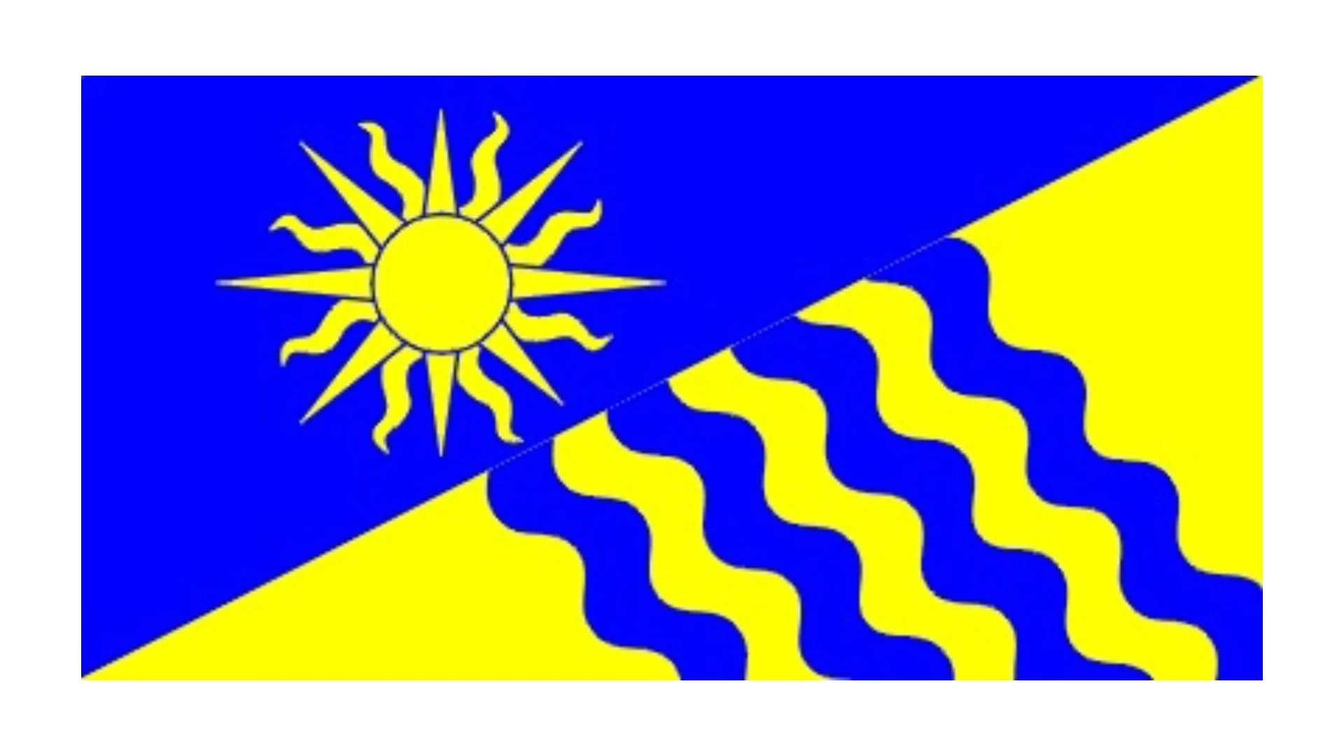
The flag of Penticton, British Columbia serves as a visual summary of the city’s geography, history, economy, and community values. Unlike many flags that rely solely on stylized graphics, Penticton’s banner is a heraldic banner of arms — meaning it directly reflects the city’s official coat of arms granted by the Canadian Heraldic Authority on October 11, 2000. This grant established a rich set of symbols that embody both the physical landscape and cultural identity of the community known as “The Peach City.”
At its core, the flag is a rectangle that replicates the shield from Penticton’s coat of arms, essentially turning the city’s heraldry into a flag. Heraldic banners like this are common for Canadian municipalities — they allow a community’s fully developed symbols to fly with the dignity and tradition of heraldry.
The field of the flag is divided diagonally — “per bend sinister Azure and Or” in heraldic terms — meaning the upper left half is blue and the lower right is gold/yellow. This division is more than decorative. The blue represents the waters of Okanagan Lake and Skaha Lake, which literally frame Penticton on both sides. These lakes are central to life in the valley: they provide recreation, natural beauty, and a climate that supports agriculture and tourism.
The golden yellow symbolizes not only sandy beaches but also the sunny, warm climate for which the Okanagan region is famous. Penticton enjoys long summers and moderate winters compared to much of Canada, a climate that has helped shape its agriculture — particularly orchards and vineyards that produce peaches, grapes, and other fruit.
Prominently placed on the blue portion is a sun in splendour, a traditional heraldic device. In Penticton’s context, the sun underscores the importance of sunshine to the community’s agricultural success and quality of life. Its rays remind observers of long growing seasons, beach days, and the warm glow that defines much of the city’s character.
Beneath the sun are four wavy lines that alternate in blue and gold. These represent water and sand together — a fitting symbol for a city literally wedged between two lakes with beloved sandy beaches on both. The waves also evoke movement and continuity, suggesting the flow of life in a community shaped by natural cycles and the rhythms of water and seasons.
Though the flag revolves around the shield, the broader coat of arms provides additional meaning. For example, the crest above the shield features a peach tree, a tribute to Penticton’s historic orchard industry and community traditions such as the annual Peach Festival. Supporting figures include the California quail and the legendary Ogopogo, reinforcing connections to local wildlife and folklore.
Displayed on municipal buildings, at civic events, and in public spaces, the flag of Penticton is more than just a marker of place — it is a symbol of identity. It celebrates land and water, sun and sand, and a community rooted in agriculture, recreation, and natural beauty. Through its heraldic design, the flag communicates both Penticton’s heritage and its aspirations, inviting residents and visitors alike to appreciate the unique qualities that make this city in the Okanagan valley “a place to stay forever.”
Recently Posted


Categories
- Alberta 24
- Armed Forces 36
- British Columbia 22
- Canada 294
- Cities 143
- County / Municipality / Regional District / Township 6
- Government 17
- Historical 3
- Indigenous 37
- International Flags 53
- International Organizations 5
- Manitoba 17
- Miscellaneous 4
- New Brunswick 7
- Newfoundland 12
- Northwest Territories 5
- Nova Scotia 13
- Nunavut 6
- Ontario 39
- Police 1
- Prince Edward Island 5
- Quebec 64
- Royalty 13
- Saskatchewan 13
- Schools 11
- Sports 23
- Yukon 4