Montreal Alouettes
Flag of the Montreal Alouettes
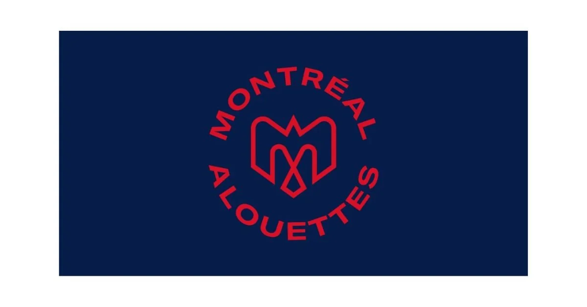
The flag of the Montreal Alouettes, featuring the team’s modern red-and-blue insignia, serves as a powerful emblem of pride, identity, and heritage for both the football club and the city it represents. While the flag is not a national or municipal banner, it has deep symbolic meaning to fans and the broader community. The design embodies the Alouettes’ spirit—resilient, bold, and proudly Montréalais—while celebrating the team’s history within Canadian football and the cultural fabric of Quebec.
The flag is typically designed with a navy-blue background, upon which sits the Alouettes’ stylized red “M” logo at the center, surrounded by the words “MONTRÉAL ALOUETTES” in bold red letters. The color palette—red, blue, and white—has long been associated with both the city of Montreal and the province of Quebec, as well as with traditional sporting symbolism of courage, strength, and loyalty. The contrast of the deep blue field with the vibrant red emblem creates a visual impact that mirrors the team’s energy and the passion of its supporters.
The “M” logo at the center of the flag is more than a simple letter—it is a carefully crafted symbol representing multiple layers of meaning. Designed during the team’s 2019 rebranding, the emblem was created to reflect the Alouettes’ connection to the city and to modernize the club’s visual identity. The shape of the “M” is stylized to resemble a bird in flight, alluding to the “alouette,” or lark, that gives the team its name. This bird imagery has been a part of the Alouettes’ identity since their founding in 1946, symbolizing speed, freedom, and elevation. The bird’s upward motion within the logo evokes ambition and aspiration—qualities that align with the team’s athletic spirit and its pursuit of excellence on the field.
The name “Alouettes” also carries significant historical and cultural weight. It was chosen in honor of the 425th Alouette Squadron, a Royal Canadian Air Force unit composed largely of French-Canadian airmen during World War II. This connection gives the team’s identity a patriotic and heroic dimension, linking sportsmanship to service and courage. The flag, through its bird imagery and military roots, serves as a tribute to perseverance and unity—values cherished by both the team and its fans.
The colors of the flag add another layer of meaning. Blue conveys confidence, stability, and trust, while red represents passion, determination, and vitality. Together, they symbolize a balance between discipline and drive—two traits essential in competitive sport. These colors also reflect Montreal’s urban vibrancy and its position as a cultural crossroads between French and English Canada.
From a design perspective, the flag exemplifies modern minimalism while maintaining historical continuity. The clean lines and geometric symmetry of the emblem make it easily recognizable and adaptable across different contexts—from stadium banners to merchandise and digital media. This simplicity reinforces the team’s branding and ensures the symbol remains timeless and versatile.
Ultimately, the flag of the Montreal Alouettes is more than a visual identifier; it is a rallying symbol for fans across Quebec and Canada. It embodies the pride of a city that has long cherished its football traditions and the resilience of a team that has weathered challenges and triumphs alike. Flying the Alouettes flag represents not only support for a team, but also allegiance to the enduring spirit of Montreal—bold, dynamic, and forever soaring.
Recently Posted
Categories
- Alberta 24
- Armed Forces 36
- British Columbia 22
- Canada 295
- Cities 143
- County / Municipality / Regional District / Township 6
- Government 17
- Historical 3
- Indigenous 37
- International Flags 53
- International Organizations 5
- Manitoba 17
- Miscellaneous 4
- New Brunswick 7
- Newfoundland 12
- Northwest Territories 5
- Nova Scotia 13
- Nunavut 6
- Ontario 39
- Police 1
- Prince Edward Island 5
- Quebec 65
- Royalty 13
- Saskatchewan 13
- Schools 11
- Sports 24
- Yukon 4