Trinity Bay North, Newfoundland
The flag of Trinity Bay North, Newfoundland
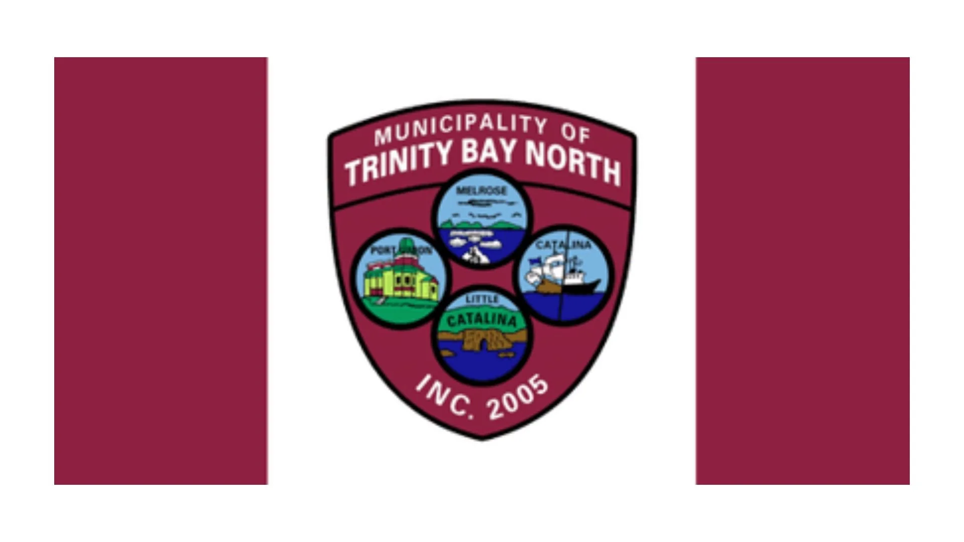
The flag of Trinity Bay North, Newfoundland and Labrador is a rich and detailed symbol that reflects the municipality’s coastal heritage, shared history, and the union of distinct communities under one civic identity. Rather than a minimalist design, the flag embraces storytelling, using colour and imagery to represent the people, places, and traditions that define life along this stretch of Newfoundland’s coastline.
At the center of the flag is a shield-shaped crest, a form often associated with protection, unity, and tradition. This shape immediately conveys a sense of strength and permanence, fitting for a municipality rooted in generations of resilience and adaptation. The crest is set against a deep maroon background, a colour that evokes dignity, pride, and endurance. Maroon is also commonly linked with heritage and seriousness of purpose, underscoring the importance of history in Trinity Bay North’s identity.
Prominently displayed at the top of the crest are the words “Municipality of Trinity Bay North,” clearly identifying the flag as a symbol of civic unity. At the bottom, “Inc. 2005” marks the year the municipality was officially incorporated, acknowledging the relatively recent amalgamation of several long-established communities. This detail highlights the balance between long local histories and a modern municipal structure.
Within the crest are four circular images, each representing one of the communities that make up Trinity Bay North: Catalina, Little Catalina, Melrose, and Port Union. Each vignette features imagery tied closely to local life. Fishing boats, coastal buildings, and shoreline scenes reflect the enduring importance of the sea and the fishery. These images honor the livelihoods, landscapes, and daily experiences that shaped each community long before amalgamation.
The inclusion of Port Union is particularly significant, as it holds an important place in Newfoundland history as a planned town associated with the Fishermen’s Protective Union. Its depiction on the flag reinforces Trinity Bay North’s connection to labour history, cooperation, and social organization. Together, the four images emphasize that while each community has its own story, they are bound together by shared geography and experience.
Colour throughout the inner images reinforces maritime themes. Blues dominate the scenes, symbolizing Trinity Bay and the Atlantic Ocean, both a source of sustenance and challenge. Greens and earth tones suggest land, settlement, and continuity, while lighter colours add contrast and clarity, making the imagery easily recognizable.
Overall, the flag of Trinity Bay North functions as a visual narrative rather than a simple emblem. It tells the story of multiple communities coming together, grounded in the sea and united by shared values. More than a marker of municipal government, the flag stands as a symbol of belonging, pride, and collective memory. It reflects a community that honors its past, recognizes its individual parts, and moves forward together under a common banner.
Recently Posted

Categories
- Alberta 24
- Armed Forces 35
- British Columbia 21
- Canada 282
- Cities 138
- County / Municipality / Regional District / Township 5
- Government 17
- Historical 3
- Indigenous 35
- International Flags 52
- International Organizations 5
- Manitoba 17
- Miscellaneous 3
- New Brunswick 6
- Newfoundland 12
- Northwest Territories 5
- Nova Scotia 11
- Nunavut 6
- Ontario 37
- Police 1
- Prince Edward Island 5
- Quebec 60
- Royalty 13
- Saskatchewan 12
- Schools 10
- Sports 22
- Yukon 4