Municipalité de Saint-Paulin, Quebec
The Flag of the Municipalité de Saint-Paulin
The flag of Saint-Paulin, Quebec, is a municipal banner that represents the history, unity, and values of this small community in the Maskinongé Regional County Municipality of Quebec. Unlike provincial or national flags, which often have long histories and widespread recognition, Saint-Paulin’s flag is a localized emblem, rooted in the town’s recent municipal history and its aspirations for progress and harmony.
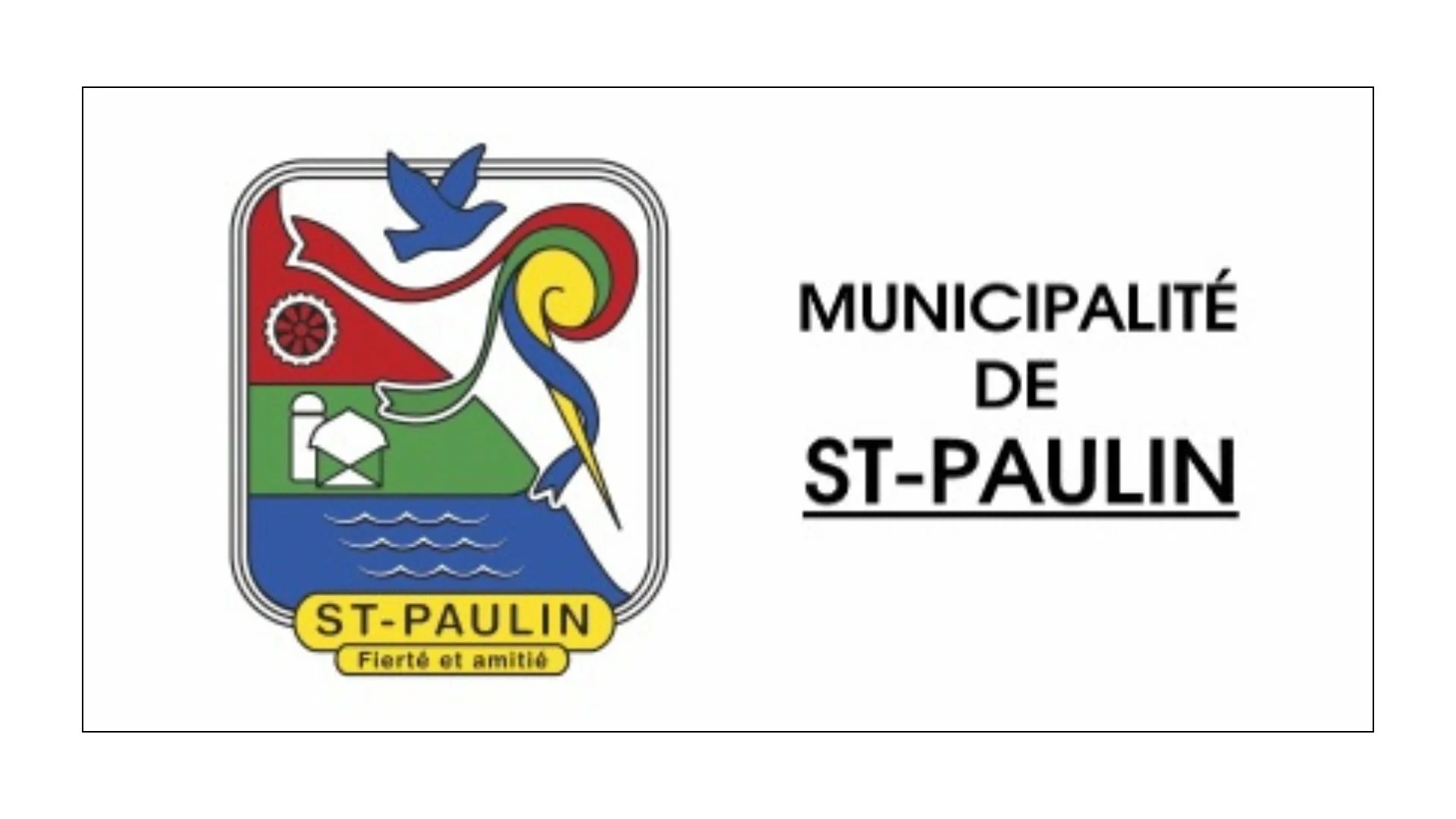
At first glance, the flag of Saint-Paulin appears relatively simple: it consists of a white field bearing the municipality’s emblem near the hoist and the name “Saint-Paulin” in the fly. This design choice — a plain white background with a central graphic and text — reflects a trend common in many smaller municipal flags, where clarity and legibility take precedence over intricate patterns.
The emblem itself carries deeper meaning. It was created to visually communicate both the heritage of Saint-Paulin and the community’s evolution over time. Central to the emblem are three colored ribbons that intersect, symbolizing the merger of three former municipalities — the village municipality of Saint-Paulin, the parish municipality of Saint-Paulin, and Hunterstown Township — into a single municipal entity in 1988. The blue ribbon wrapping around the letter “P” forms an “S” shape, cleverly integrating the initials of Saint-Paulin into the design.
At the top of the emblem, a bird in flight represents communication and expansion. This motif reflects the town’s willingness to reach beyond itself and embrace growth, both socially and economically. Its presence on the flag emphasizes the importance of connection — among residents, with neighboring communities, and within broader regional networks.
On the left side of the emblem are three additional symbols: a cog wheel, a farm, and stylized waves. Each element points to a pillar of the municipality’s character. The cog wheel stands for industry that is “ever evolving,” a recognition of the contributions of local businesses and the labor force. The farm represents agriculture in progression, acknowledging the rural roots of Saint-Paulin and the role of farming in its economy. The waves symbolize the significant watercourses in the area, underscoring the natural environment’s ongoing influence on community life.
The colors chosen for the emblem are also meaningful. Yellow signifies faith, an important cultural value in many Quebec communities. Blue expresses power and joy, while green evokes hope, serenity, and plenty. Red stands for enterprise and union — energetic qualities that reflect a community eager to work together constructively. White, which makes up the flag’s background, symbolizes accessibility and openness.
Completing the emblem is the French motto “Fierté et amitié” (Pride and Friendship), which encapsulates the spirit that Saint-Paulin wishes to project: a town proud of its heritage and welcoming to all who live there or visit.
In sum, while the flag of Saint-Paulin might not be widely known outside regional or municipal circles, it serves an important role within the community. Its design brings together symbols of unity, economic life, faith, and natural surroundings. Far from arbitrary, each element carries intentional meaning, offering both residents and visitors a visible reminder of what defines Saint-Paulin — its history of cooperation, its rural and industrial foundations, and its commitment to an inclusive, forward-looking identity.
Recently Posted


Categories
- Alberta 24
- Armed Forces 36
- British Columbia 21
- Canada 289
- Cities 140
- County / Municipality / Regional District / Township 6
- Government 17
- Historical 3
- Indigenous 36
- International Flags 53
- International Organizations 5
- Manitoba 17
- Miscellaneous 4
- New Brunswick 7
- Newfoundland 12
- Northwest Territories 5
- Nova Scotia 12
- Nunavut 6
- Ontario 38
- Police 1
- Prince Edward Island 5
- Quebec 63
- Royalty 13
- Saskatchewan 12
- Schools 11
- Sports 22
- Yukon 4